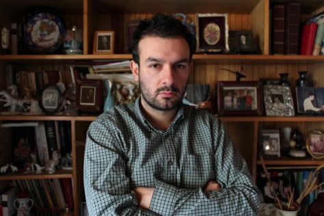
Thirty-two-year-old Dutch artist, Parra, is a rising star in both the commercial and fine art worlds. His bright colors and mastery of illustrated fonts, combined with his wit and cynicism make his work a treat, not only to the eyes, but also to the dark little side of us that finds pleasure in the misfortune of others.
What's an average day consist of for Parra?
It’s very laid back, just like Amsterdam. I’m not a morning person; I wake up around 11, check email and stuff, cook up some breakfast and start drawing. If there’s commercial work to do, I try to get that sorted, and if not, I work on my own art all day, read some books, and watch some stupid movies to get inspiration. In the evenings, I go out…a lot. That’s basically every day. When you work for yourself, you don’t really have weekends, and with international clients, the clock is always [running].
How does your creative process work?
It all starts out with pen and paper, and some useless information, like music lyrics. I watch a lot of really bad TV and old movies. I’ll watch stupid 80’s clips on YouTube for hours. Then something will spark me – I’ll have an idea, a funny sentence or something ironic, and I’ll start drawing. Then I scan it into the computer and do the colors. The thought process is much longer than the actual drawing.
How did you develop your style?
I was doing graphic design when I first moved to Amsterdam (around 1997) – mostly flyers. I got bored with the rules, like what fonts you can and cannot use. So I started to draw everything, to have more freedom. I gradually went from tracing fonts and using photos, to eliminating the pictures all together and just drawing everything. Well, it’s really hard to draw actual people, and if you draw someone with eyes and a nose and face, it is quickly typecast. I needed something anonymous. So I created this weird beak-faced character with a human body. It’s the same character every time, whether it’s a guy or girl or animal or whatever.
So how did you break out from being a local artist doing flyers in Amsterdam, to reach the level you are at today?
This art director literally picked a flyer I had done up off the street and tracked me down. Amsterdam is really small, so he found me in a day. Back then, everybody was into design, and everything was nice and straight, and I had done this weird flyer with hand-written fonts, so it stood out for that period. He was looking for an illustrator to do a campaign for a sneaker store. He dragged me in and that really gave me a push. So I just started drawing more and more, and began to be able to live off my work. After I had a solo art show in London, I got picked up by the agency Big Active and everything went easier from there.
Your work features bright colors and humor; it seems happy and whimsical. Is this a reflection of your personality?
My name, Parra, is short for paranoid. I want to be light and happy, but I’m not. I’m never positive. But I’m a worrier more than a dark person. If you view my work, and don’t know what it’s about, it appears happy. It has happy colors and is easy to digest. Someone from 8 to 80 years old might like it. But deeper in, most of my work has something dark. Irony is my favorite stuff. Some of the most crappy stuff in life, I find amusing.
You work predominantly with Giclé prints. How did you come upon this medium, and are you worried that, as a fine art medium, a digital print may have less intrinsic value than an original drawing, lithograph, or even screen print?
When I had the opportunity to do my first solo show, I needed something fast and I figured that Giclé posters would be easy. And I kind of stuck with it. The thing is, I draw on paper. I could easily do bigger sketches and frame them and they’d be more valuable. But deep down, I still love graphic design so much – printed matter, and I really love color in a big way, and you have to be a damn good painter to get it that tight, and I still want to learn that one day, so for now, it’s posters mainly.
I think the silk screen was the Giclé of that time period. It was intended to reproduce an image. Now, [silk screen prints] are seen more as an art form because there is more hand-work involved. But I don’t care if there’re hundreds of prints out there. I usually only do 10-15 prints of a piece, and they’re all signed and come with a stamp of authenticity from my agency. Last year (2007) I did 7 shows, and I showed almost all new work at each show, with only a few of my favorite pieces shared between shows. So that’s not many prints.
What do you have lined up for the rest of 2008?
I’m talking to some book people about doing a book. New collections for Rockwell. Collabs with some apparel people. Some shoes coming up. Collabs with Patta, a local sneaker shop here in Amsterdam. I’m drawing a lot, but I’m only going to do one show in Paris at the end of the year. I cancelled a bunch of stuff in order to focus on that. I think I might work on some sculptures too.
What do you think of your hometown scene, here in Amsterdam?
It’s so small out here. You get noticed pretty quick if you do something different. I was lucky to be doing something weird at a good time and I got accepted. Delta was a big inspiration for me to work on my own stuff. We’ve got a nice cozy, little scene here, with musicians and art people and the fashion peeps. I couldn’t do without it. It’s really nice out here. Except the weather…
 Q&A with Larry Gus
 We Own the Night: The Edison
No Comments