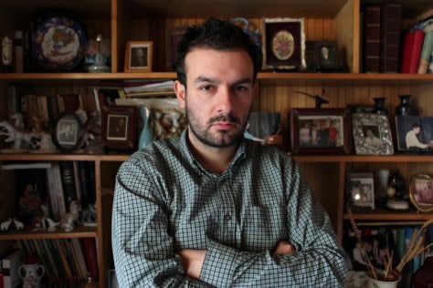
Sam Martineau makes thoughtful collages on LPs, using the square shape of the covers, the records inside and the plastic sleeves as essential forms. In his collages and larger paintings on muslin, he marries the rigid lines of modernism to brushy, bright abstraction and decoupaged personal items like
matchbooks and tissues. The Brooklyn-based artist has a set of individually collaged records for a split single with the bands Harbor Lights and Ribs, produced by Power Records and debuting this fall. His work is currently on view in the group exhibition “Outside the Time Zone” at Camel Art Space in Williamsburg, August 14–September 6.
Here, Sam talks about his practice—and his record collection.
I went through the LPs in the show, and I was happy to find record covers painted on both sides. They feel very American man bad-ass, with race cars, pin-up girls and six-packs.
One of the best things about using LP covers for collages is that there is a whole history of album covers. It’s a way to tap into some of the genres like cheesecake photographs of women and auto racing. Sometimes the records actually have the soundtracks to Daytona races, with the loud souped-up sound. There are more liberties to be taken with the LP collages.
I love the idea of the sound of the race car actually as the sound of the LP. Especially as a race car speeds along a circular track… When I was going through them I felt that these were much more about the records themselves, than about music or sound. More about the records as objects, vintage objects.
The records inside are a grab-bag. Some are doubles of what I have in my collection, there’s a lot of Jazz records, Benny Goodman, Earl Hines, Lester Young or records I’ve found in dollar bins. I started just buying the cheap ones because they were too good to pass up, and I’d give them to friends, and then I started using them for the LP collages.
They’re blank slates. The music inside doesn’t matter as much as what they look like.
They’re based strictly on the visual element, the format of the square, and the blank white LP. There are a few collages on albums that already have an original cover design on it, I work with the shapes and colors already there. The records inside are secondary, but all the records are good, they’re really good.
They feel so personal, within the abstraction. The kale wrappers hint that you had kale for dinner that night, the tissues like they came from a girl you like.
It’s sincere. The LP collages are so object-oriented. They incorporate things that pass through hands easily, books and magazines, six-pack rings, cartons, rubber bands, crossword puzzles, lipstick from my girlfriend. It all fits in that 12 x 12 inch format. The paintings are much more distilled. The collages are much more interactive like pop abstraction in a way, so they don’t exclude the day-to-day stuff that’s around which has just as much clout as paper cutouts, right angles, and the colored shapes that are in the paintings. The objects find a balance at the LP scale and interact with one another.
Those are the lyrical elements, like you’re composing a new song for that record.
The cover is a fantasy space based on look and feel, and there’s the sense that I’m making LPs for something. I listen to records, I collect records and I make collages, but I can use that 12 x 12 inch blank LP space as a ground to work on top of.
You use recurrent L-shaped stripes that have right angles, and a thicker horizontal line than the vertical one. They are very particular, and seem like an insignia.
A friend mentioned that, and I had to really think back to where they came from. When I first moved to New York I took a lot of photographs driving around for my job at the time. I think it’s the way I first saw the city, looking at architecture, where sometimes you only see the top and sides of buildings as you’re going down an avenue. Another side is trimming paper for collages, you’re left with the tops and sides of something. Symbolically, it’s something that becomes introduced into my visual vocabulary. When I look at them I think they represent an extreme order, a kind of minimalism with aspects of Donald Judd’s work. Early modernism and formalism are also heavy influences. Modernism is not whole or pure in my work, but is introduced into the other work that I do. I take those right angles, juxtapose and integrate them to an unexpected situation with the female figures or the race cars or old stereo advertisements, etcetera.
All the things you use have the vintage quality of the records themselves. The race cars are vintage ones with big wheels and long skinny hoods, not contemporary Nascar-type cars.
They are beautiful old photographs. I have stacks and stacks of clipped pages like these that I collect from magazines and books. They are basically personal interest, motorcycles, soccer, Penthouse girls, interiors, they all become a fantasy space.
I think the sense of an ideal, or dream space is so related to your very American subjects.
Maybe it is American, but I don’t really indulge in anything that’s not my personal experience or that I don’t have a direct relationship to. I have family members who are mechanics, who work and ride motorcycles. I go to car and bike shows when I’m in Ohio. I played soccer for fifteen years. These things offer up a lot of visual elements that find their way into my work—the structure, shape and color of a soccer field, streamlined auto parts and racing graphics. Some of these things happen to be very American topics, but it is not something I intended to address specifically. They are the results of my interests.
That sincere interest in those things is really there. Even with the six-packs and the vegetables—I really get that you love those things.
Found objects have two sides. They are the object that you look at ideally for what it is and the function it has, and second, you look for new meaning when that thing is pushed up against something.
What’s it like to live in your studio?
Daily elements enter into my studio practice. These things around me have as much potential as paint on a brush does. I enjoy making the collages as much as I can because all of those things help to shape the visual language in my paintings.
You’re very successful at making a record cover into an ideal space, a mini-utopia. I don’t think a record cover is an ideal space, it’s a commercial space meant to get someone to purchase music. You’ve erased that aspect of the LPs, so I think they are paintings, not record covers.
I like to think of them as a space where an artwork and an imaginary album can exist. Actually, I am trying to sell records, I’m helping put out Power Records’ first 7-inch record. I made 500 individually collaged 7-inch covers for a split single featuring the bands Harbor Lights and Ribs.
Which are the best album covers—that aren’t yours?
There’s a lot, A Touch of Taylor by Billy Taylor is amazing, for the benday dot screen, Today by Galaxy 500, lots of others, it’s one of those things. Guided by Voices did 500 album covers for Propeller, every single one is different, done by the band members and other people who worked with the band. Album covers are amazing because they sell out and they evolve. Using them as a space to make collages fits into that evolution.
Power Recordings homepage (download the music from the Harbor Lights single here―it rocks!)
“Outside the Time Zone” homepage
Sam Martineau’s LP collages and paintings are on view in “Outside the Time Zone,” a group exhibition organized by Christopher Rawson and Julian Calero, August 14–September 6 at Camel Art Space in Williamsburg, 722 Metropolitan Ave., just off the Graham St. L stop.
For more information, contact info@outsidethetimezone.com.
 Q&A with Larry Gus
 We Own the Night: The Edison
No Comments